Partial Borders in CSS
Landon Schropp •
Have you ever wanted to create a border in CSS that only extends across part of an element? It's possible by applying margins, but that can get messy when you want your content to extend beyond its border. Here's a handy technique that uses box shadows to achieve the same result.
How It's Done
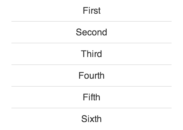
Typically, when using a border to separate elements in a list, you would do something like this:
li {
  border-bottom: 1px solid #ddd;
}

li:last-of-type {
  border-bottom-width: 0;
}
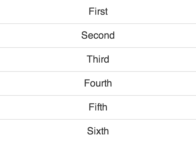
You can achieve the same effect by using box shadows instead.
li {
  box-shadow: inset 0 -1px 0 0 #ddd;
}

li:last-of-type {
  box-shadow: none;
}
One nifty aspect of box shadows is that CSS allows you to use more than one of them. You can take advantage of this by stacking two shadows on top of your content.
li {
  box-shadow: inset 20px 0 0 0 #ee003e,
              inset -20px 0 0 0 #ee003e,
              inset 0 -1px 0 0 #ddd;
}
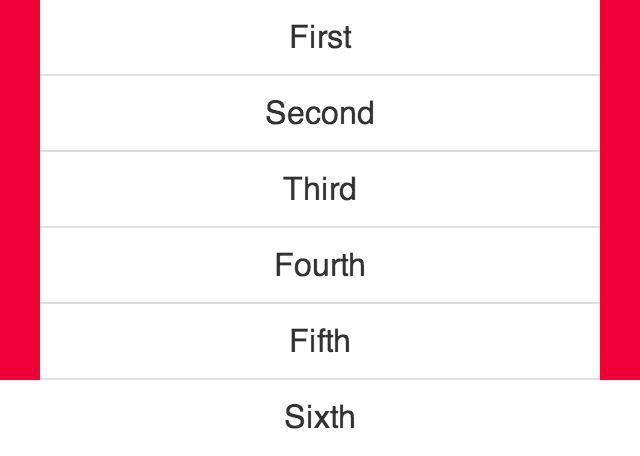
Finally, all you have to do is set the top shadows to be the same color as the background and you're done!
li {
  box-shadow: inset 20px 0 0 0 white,
              inset -20px 0 0 0 white,
              inset 0 -1px 0 0 #ddd;
}
